Mastering Three-Column Layouts in Web Development: A Comprehensive Guide
Navigating the Seas of Layout Design – A Deep Dive into Three-Column Mastery with CSS Floats, Flexbox, and Bootstrap


In the vast landscape of web development, crafting effective and visually appealing layouts is a crucial aspect. As websites and applications evolve, the demand for responsive and dynamic layouts has become paramount. In this article, we will delve into the art of creating three-column layouts, exploring traditional CSS floats and modern approaches like Flexbox and Bootstrap's grid system as this is one of the major challenges for newbies.
Overview of Layout Design
Web developers constantly strive to strike a balance between aesthetics and functionality. Layout design plays a pivotal role in achieving this balance, determining how elements are arranged on a webpage. A well-designed layout ensures a seamless user experience across various devices.
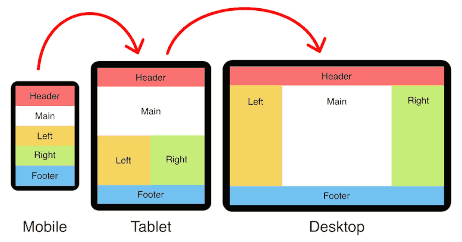
Importance of Responsive and Dynamic Layouts
With the proliferation of devices with different screen sizes, creating layouts that adapt to varying resolutions is crucial. Responsive and dynamic layouts enhance user accessibility and satisfaction, making websites and applications more user-friendly.
Mention of Traditional Methods and Modern Frameworks
Over the years, web developers have employed various techniques to create layouts. Traditional methods, such as using CSS floats, have been widely used. However, modern frameworks like Flexbox and Bootstrap offer more efficient and flexible solutions. In this article, we'll explore the pros and cons of both approaches.
Using Floats for Three Columns in CSS
Explanation of the Float Property in CSS
The float property in CSS has long been a stalwart for creating layouts. It allows elements to be shifted to the left or right, facilitating the creation of multi-column structures. Understanding how to harness the power of floats is a fundamental skill for web developers.
Step-by-Step Guide to Creating Three Columns Using Floats
HTML Structure for the Layout
<!DOCTYPE html>
<html lang="en">
<head>
    <meta charset="UTF-8">
    <meta name="viewport" content="width=device-width, initial-scale=1.0">
    <link rel="stylesheet" href="styles.css">
    <title>Floats Layout</title>
</head>
<body>
    <div class="container">
        <div class="column">Column 1</div>
        <div class="column">Column 2</div>
        <div class="column">Column 3</div>
    </div>
</body>
</html>
Applying CSS Styles for Each Column
body {
    margin: 0;
    font-family: 'Arial', sans-serif;
}
.container {
    width:100%;
}
.column {
    width: 30%;
    float: left;
    margin: 1%;
    background-color: #e0e0e0;
    padding: 20px;
    box-sizing: border-box;
}
Handling Common Challenges and Issues with Floats
While floats are powerful, they come with challenges, such as clearfix for containing floated elements and issues with equal height columns. Strategies like clearfix and using pseudo-elements can help address these challenges.
A simple way to declare clearfix is:
.clearfix::after{
    content:'';
    display:table;
    clear:both; /* You can call right or left as its
property depending on where you're trying to apply it*/
}
Another way to overcome the challenges that come with float is to use Flexbox.
Flexbox for Three Columns in CSS
Introduction to Flexbox and Its Advantages Over Floats
Flexbox, a modern layout model in CSS, brings a paradigm shift in the way we approach layouts. Unlike floats, Flexbox provides a more efficient and predictable way to distribute space among items in a container, even when the size of the items is unknown or dynamic.
Step-by-Step Guide to Creating Three Columns Using Flexbox
HTML Structure for Flexbox Layout
<!DOCTYPE html>
<html lang="en">
<head>
    <meta charset="UTF-8">
    <meta name="viewport" content="width=device-width, initial-scale=1.0">
    <link rel="stylesheet" href="styles.css">
    <title>Flexbox Layout</title>
</head>
<body>
    <div class="flex-container">
        <div class="flex-item">Column 1</div>
        <div class="flex-item">Column 2</div>
        <div class="flex-item">Column 3</div>
    </div>
</body>
</html>
Applying Flexbox Properties for Column Alignment
body {
    margin: 0;
    font-family: 'Arial', sans-serif;
}

.flex-container {
    display: flex;
}

.flex-item {
    flex: 1;
    margin: 1%;
    background-color: #e0e0e0;
    padding: 20px;
    box-sizing: border-box;
}
Handling Responsive Design with Flexbox
Flexbox inherently lends itself to responsive design. By adjusting flex properties and utilizing media queries, we can create layouts that gracefully adapt to different screen sizes.
Bootstrap's Row and Cols for Three Columns
Overview of Bootstrap Framework and Its Grid System
Bootstrap, a popular front-end framework, simplifies the process of creating responsive and mobile-first websites. The grid system in Bootstrap allows developers to construct flexible and consistent layouts with ease.
Step-by-Step Guide to Creating Three Columns Using Bootstrap's Grid
Including Bootstrap in Your Project
To use Bootstrap, include the following link in the <head> of your HTML document:
<!DOCTYPE html>
<html lang="en">
<head>
    <meta charset="UTF-8">
    <meta name="viewport" content="width=device-width, initial-scale=1.0">
    <link rel="stylesheet" href="https://stackpath.bootstrapcdn.com/bootstrap/4.3.1/css/bootstrap.min.css">
    <title>Bootstrap Layout</title>
</head>
Utilizing the "row" Class
<body>
   <div class="container">
        <div class="row">
            <div class="col">Column 1</div>
            <div class="col">Column 2</div>
            <div class="col">Column 3</div>
        </div>
    </div>
</body>
Creating Columns with the "col" Classes
Bootstrap's grid system employs a 12-column layout. By assigning appropriate col classes, we can create a three-column layout.
Making the Layout Responsive with Bootstrap's Grid System
Bootstrap provides classes like col-sm,col-md and col-lg for handling responsiveness. By utilizing these classes within media queries, we can ensure a seamless transition between different screen sizes.
Pros and Cons Comparison
Discussing the Advantages and Disadvantages of Using Floats
Advantages of Floats:
Simplicity: Floats are easy to understand and implement.
Widespread Support: Almost all browsers support the float property.
Disadvantages of Floats:
Complex Clearfix: Dealing with clearfix for containing floated elements can be cumbersome.
Challenges with Equal Height Columns: Achieving equal height columns can be tricky.
Highlighting the Strengths and Weaknesses of Flexbox for Layout Design
Advantages of Flexbox:
Simplified Alignment: Flexbox makes it easy to align items both horizontally and vertically.
Dynamic Sizing: Flexbox handles dynamic content and unknown dimensions gracefully.
Disadvantage of Flexbox:
- Browser Compatibility: While widely supported, some older browsers may have issues.
Evaluating the Benefits and Limitations of Bootstrap's Grid System
Advantages of Bootstrap's Grid System:
Rapid Development: Bootstrap streamlines the development process with pre-designed components.
Responsive by Default: The grid system ensures responsiveness without much manual intervention.
Disadvantages of Bootstrap's Grid System:
Learning Curve: Mastery of the entire Bootstrap framework might take time.
Customization Challenges: Extensive customization may require overriding default styles.
Best Practices and Tips
General Best Practices for Creating Layouts in CSS
Use Semantic HTML: Employing semantic HTML elements enhances code readability.
Separation of Concerns: Keep HTML, CSS, and JavaScript in separate files for maintainability.
Consistent Naming Conventions: Adopt a consistent and meaningful naming convention for classes and IDs.
Tips for Optimizing and Improving Performance in Each Method
Floats:
Minimize Float Usage: Limit the use of floats to cases where Flexbox or other modern solutions are not viable.
Use clearfix judiciously: Apply clearfix only when necessary to avoid unnecessary complications.
Flexbox:
Leverage Flex Properties: Utilize flex properties to their full potential for efficient layout design.
Understand the Flex Container: Properly grasp the concepts of flex containers and items for effective implementation.
Bootstrap:
Customize Responsibly: Customize Bootstrap styles judiciously to maintain the benefits of rapid development.
Stay Updated: Keep the Bootstrap version up to date to benefit from bug fixes and new features. The current version is B5.
Common Troubleshooting Techniques for Layout Issues
Inspect Element Tool: Use browser developer tools to inspect and troubleshoot layout issues interactively.
Validation: Validate HTML and CSS to ensure compliance with standards, reducing the likelihood of rendering problems.
Check Browser Compatibility: Confirm that your chosen layout method is supported across major browsers.
Conclusion
In this comprehensive guide, we explored three distinct methods for creating three-column layouts: CSS floats, Flexbox, and Bootstrap's grid system. Each method has its strengths and weaknesses, catering to different project requirements and developer preferences.
The choice between traditional methods and modern frameworks ultimately depends on the specific needs of your project. Understanding the strengths and weaknesses of each method empowers you to make informed decisions, leading to more efficient and maintainable code.
Web development is a dynamic field, and constant exploration and experimentation are key to staying ahead. Whether you choose the simplicity of floats, the flexibility of Flexbox, or the convenience of Bootstrap, continue to delve deeper, experiment with variations, and stay abreast of emerging trends in layout design.
In mastering the art of three-column layouts, you equip yourself with the tools to create visually stunning and highly functional websites in the ever-evolving landscape of web development.
I hope you found this useful. I would like to hear from you so feel free to drop a comment or connect with me via Twitter.